2024 Colors of the Year – How to Incorporate Them into Your Wedding
- Sep 18, 2024
- 3 min read
Have you heard of the Color of the Year before? Several sources release a different color every year, and we wanted to feature them here with ways you might include them in your wedding, from going full-out to subtle touches. Have you decided on a color palette for your big day? Use our guide to 2024’s Colors of the Year to inspire you!
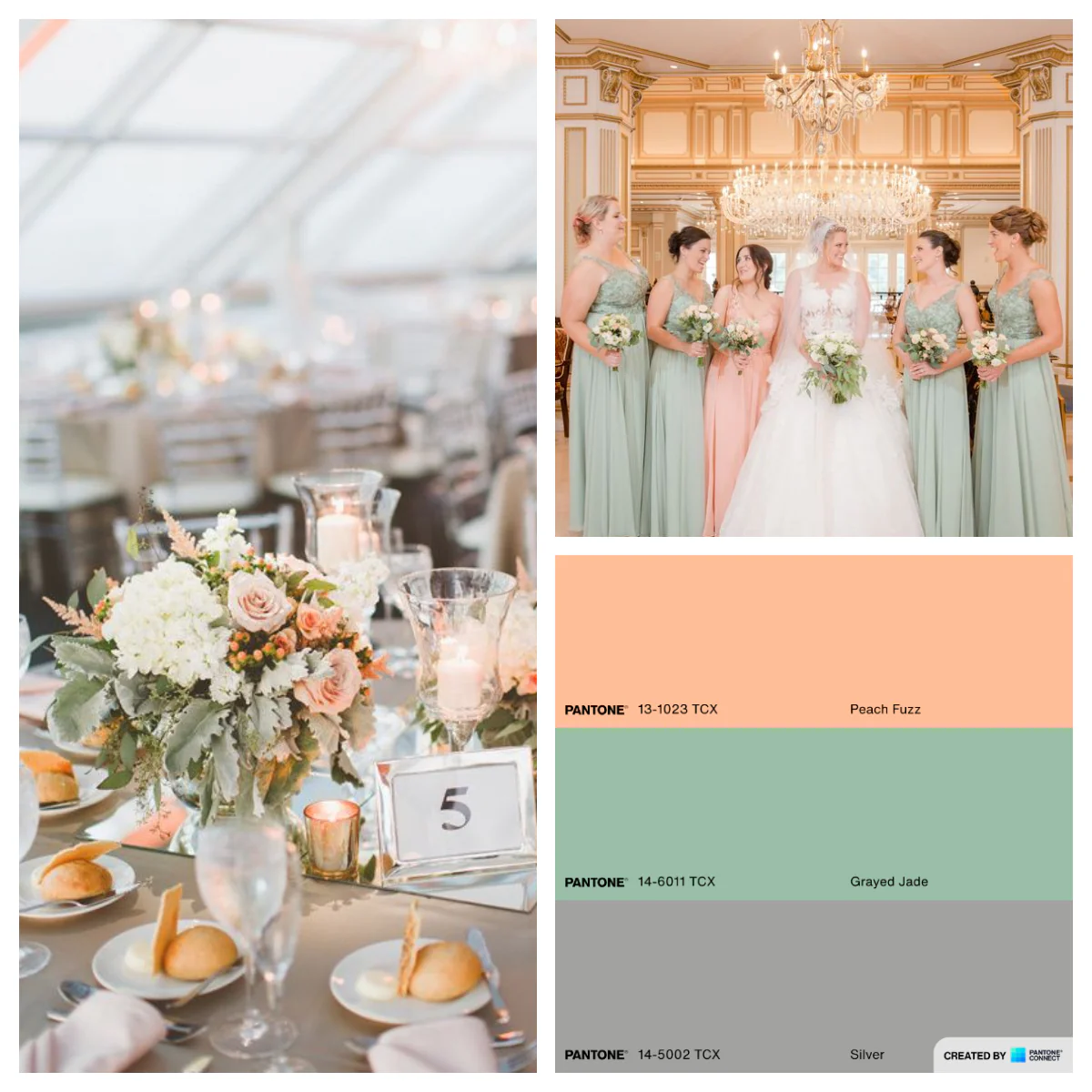
Pantone – Peach Fuzz

Pantone’s Peach Fuzz is velvety and gentle, and meant to make you feel warm and fuzzy inside. Its spirit enriches the mind, body and soul, echoing our innate yearning for closeness and connection. This delicate shade sits between pink and orange, and has a lot of potential to be a main player in your wedding palette, or can play harmoniously with other shades.
Benjamin Moore – Blue Nova

Inspired by exploration, Benjamin Moore chose Blue Nova, the cosmic, blue-violet blend as its Color of the Year to encourage adventure and engaging in new experiences—a wedding is the perfect inspiration!
Whether you choose a monochromatic palette or go with something on the opposite side of the color wheel, Blue Nova evokes feelings of fun and excitement.
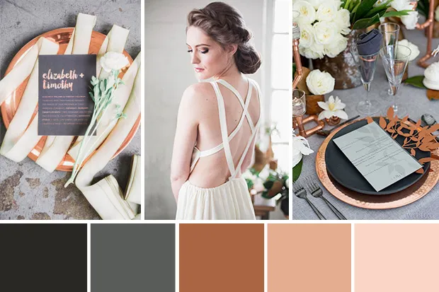
Behr – Cracked Pepper

Behr’s Color of the Year is a lovely soft black that is classic and timeless. It can ground and meld as a neutral with any color palette while not being too dark and heavy.
This shade can go well in a palette full of neutrals, or as a base for some fun, bright tones—let your imagination really play with this warm, soft shade!
Sherwin-Williams – Upward

Upward from Sherwin-Williams is a relaxing blue that begs you to take a slow, deep breath of crisp air. It evokes feelings of a carefree, sunny day full of contentment and peace, which ones hopes to feel on their wedding day.
Pair this color in your coastal chic-inspired palette, or let it speak more as a neutral with some bubbly brights—you can’t go wrong with this as your something blue!
Glidden - Limitless

Glidden’s Limitless is a honey beige hue with the stamina of a primary color, and the versatility of a neutral. This warm, buttery yellow evokes the sense of a warm hug on a sunny day, enveloping you in a sense of joy. You can’t go wrong with how you choose to incorporate this shade in your palette.
Valspar – Renew Blue

Valspar’s choice for its 15th anniversary entry is inspired by nature; glacier lakes, fog, mist and clouds. This hue is meant to evoke feelings of balance and calm, juxtaposed with uniqueness. Blue balanced with a touch of grayed sea green, this color is classic and timeless.
HGTV Home by Sherwin-Williams – Persimmon

This warm lovely hue chosen by HGTV Home by Sherwin-Williams balances the energy of tangerine with grounded neutral undertones, making it perfect to serve as a pop of color in your palette, or more of a neutral against other bold statement shades.
Graham & Brown – Viridis

Connected by nature, Viridis by Graham & Brown is a muted green shade that creates a calming effect with tones of new beginnings--perfect for a wedding. It also reflects harmony and stability, and symbolizes growth and health, and would make a perfect complement to any colorful color palette.
Krylon – Bluebird

If bold colors are more your thing, Krylon’s Bluebird might be the perfect choice for you. This reimagined pale blue has been amped up into a punchier blue, evoking joy and harmonizing perfectly with both warm and cool shades. It also blends perfectly with multiple styles, from contemporary to retro.
We hope you enjoyed this colorful journey into some of this year's top color choices, and how you might apply the to your own wedding. Color inspiration can come from anywhere--if you just know where to look. Happy exploring! <3


Comments